Tuesday, July 21, 2015

Final Project: Artifact Logo


For our project I designed a new logo for Coastscape. Coastscape is a landscaping company in Australia. They work primarily with the wealthiest individuals in the country. After we discussed our audience I wrote some personas of the types of clients we would want.

Jane is a 46 year old lawyer. She is married to a 50 year old financial dealer. Due to the stressful nature of both of their jobs they are looking to put up a fence around their property for noise reduction. They are also looking to design an oasis in their yard with a water feature to make it a nice place for them to relax.

Kyle is a 38 year old surgeon who just moved into a new house and is looking to personalize the landscaping around his property because of limited time he needs to work with a company that will be able to take care of every aspect of the new landscaping.

Brad is a 55 year old psychiatrist. He is married with 2 children. Their family just inherited money from a loved one and want to use it to create a place in their backyard for entertaining guest. They are interested in getting a total remodel and creating a space with all of the amenities they can possibly have including a patio, lightening, and rock walls.
Once we had our target audience identified we created a design plan that we thought would be best to appeal to the audience. We liked the idea of keeping everything simple and classy. So we were striving for a very clean design with a natural color palette for a base with gold accents.
Lacey created this style guide, based on our group conversation, for conceptual base for our individual artifacts.


My artifact was the companies logo and I decided I wanted to keep the design very simple and clean. I used the fonts we decided on for our project and the color scheme. I decide to use a black background because I thought it provided more contrast for the gold words. I used a gold leaf background to give the text and tree more dimension and depth. I also think this helps make the logo more interesting and give it that classy element I wanted. I think the design follows a few gestalt principle mainly the law of pragnanz because everything on the logo is in its simplest form. This helps for everything to come together in the design. The axioms of webdesign wasn't as applicable to my personal artifact because the logo will need to be displayed on multiple different medias. Overall I am extremely happy with how this design turned out.

Website url: misspey10.wiks.com/coastscape

Tuesday, July 14, 2015

Mis-en- Scene

I decided to use a scene from Snow White and the Huntsman.
Disclaimer: I am analyzing this movie's costumes, which I personally think were outstanding. The movie as a whole in my opinion was subpar and had some serious acting and pacing problems. With that being said here is the scene.


The costume designer for this movie is named Colleen Atwood, and she is one of my personal favorite costume designers. She has won 3 Oscars for Costume Design and has had 11 Oscar nominations. I think the work that she did for this scene in particular was breathe taking.

There is so much symbolism in her costumes and they help the audience identify the character and some of their personality traits. I included another video below where Colleen talks about each character and what went into their costumes for the film.

I think that the cape in the sequence about is definitely the stand out costume piece of this film. The way it was created to tell the story of the queens transformation is superb. I think that so much went into this design on many different levels. Visually the collar is symbolic of power while the color is symbolic of death or loss. It is such a contradiction. I think that the costume really lends itself to the effects of the Queens transformation to and from the ravens. From a visual design standpoint I think that Colleen really hit the mark in all areas. Her designs are seamless and bring so much texture and form to film. They also communicate so much about the character and their transitions. The Queen in particular starts in lighter costumes, but her costumes deteriorate with her as she progress through the film. They give the audience so much contextual information about her. One of the most interesting examples of this is many of her costumes are designed to look like torture devices. I think this says a lot about the psychological state of the character. It says that she is desperate and will go to any lengths to get what she desires.

I think that Colleen Atwood is an extremely brilliant designer, and I think it is incredible what she can do with fabric to tell a story.

Snow White and the Huntsman
Director: Rupert Sanders
Production Design: Dominic Watkins
Art Director: Andrew Ackland-Snow

Colleen was under Dominic the Production Designer for this movie. There was not a lot of information about their working relationship on the film or the responsibilities each had. I was able to find that this was the first film they worked on together.


Thursday, July 9, 2015

Compose your Frame


I took this picture near my house from a little running trail. I thought it was a nice example of the rule of thirds. The tree trunks follow the vertical lines very well. There is also a tree that is growing horizontally that follows the top third line. The lower third section is composed of the bushed that were closer to me on the path before the hill dipped into the gully. These bushes are not quite lined up with the exact third lines but I think the picture still has a similar effect. 

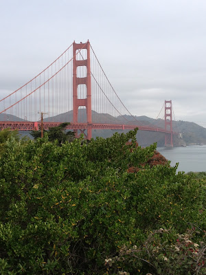
The next pictures are some I have taken while traveling. I obviously didn't take them specifically for this project, but I thought that I would include them because I thought they were good examples of the rules we discussed. 


I think this is a great example of the diagonal rule. 


I think this could be an example of index vectors because the way the path guides the focus of the picture to the tower. It could also kinda fit the rule of thirds. 


Thursday, July 2, 2015

Axioms of Web Design

Guess Clothing 
http://www.guess.com


This is the landing page of Guess's website. This is the first image on the page, but users can scroll down and see more images set up in a grid with the same clean white boards that you can see at the top of the page. I think the images that are featured on this site are pretty generic fashion images and while that might not be the most interesting thing for viewers it helps to identify the companies goals immediately when users arrive at this page. 


As users scroll over images different options will come up that provide links to other areas of the page, videos and links to social media pages. I think this helps the design become more interactive and intuitive. Another thing that helps with the intuitiveness of this design is that it has many different way to get to the same place. Obviously the companies goals are for the viewers to go shop on their site and buy their product.  For example clicking the company name at the top will led users to the online store, but there is also a link at the bottom of the page that say shop online now. 


 This image shows a little bit more of the grid I discussed earlier. I think the angles of the white grid help give the pictures a nice clean frame. They also help move the eyes down to the link to the store. This call to action is featured on the bottom of the page. I think the white font type works for this because the boarders of the grid are also all in white so the eye has been trained on the page already to focus on the white text. Unfortunately, this page only shows up on computers. When i tried to access it on a phone or tablet the site went straight to the online store. Despite that I still think this is a very good layout. The design is aesthetically pleasing to me and really accomplishes the goals of the company.